human MEDICAL CARE
Logo and business card proposals for a Medical Care Practice
GOAL
The brief was to create a logo and business card proposal for a medical doctor specialized in targeted specialized data-driven metabolic reconditioning. The doctor's practice focuses on one-on-one predictive and preventative medicine for high profile clients.
PROCESS
After some research into the practice and medical practices connected to personalized, preventative medicine, some concepts and keywords started emerging. The initial ideas revolved around the DNA double helix, the idea of target and the human figure. Putting these elements together, I drew inspiration from Leonardo da Vinci's Vitruvian Man. A human figure is standing with open arms in front of a DNA sequence and with his/her heart in evidence on his/her chest. With the human figure at the center of the circle, the focus is on PERSONALIZATION, suggesting the doctor will use their heart to PROACTIVELY CARE for the patient, with the DNA the SCIENTIFIC PRECISION of her approach in PREVENTION as well as treatment to restore and maintain the patients' wellbeing. The dark blue to convey professionalism and sophistication.
OUTPUT
Three different variations on the theme of Leonardo da Vinci’s Vitruvian Man inspired logo, each of them in two colors, dark blue and light blue. The first one is the most complex, with the DNA double helix with a background in a different color; the second one still has the DNA sequence but without the different color background; the third only has the human at the center with the heart, without the DNA double helix at all.
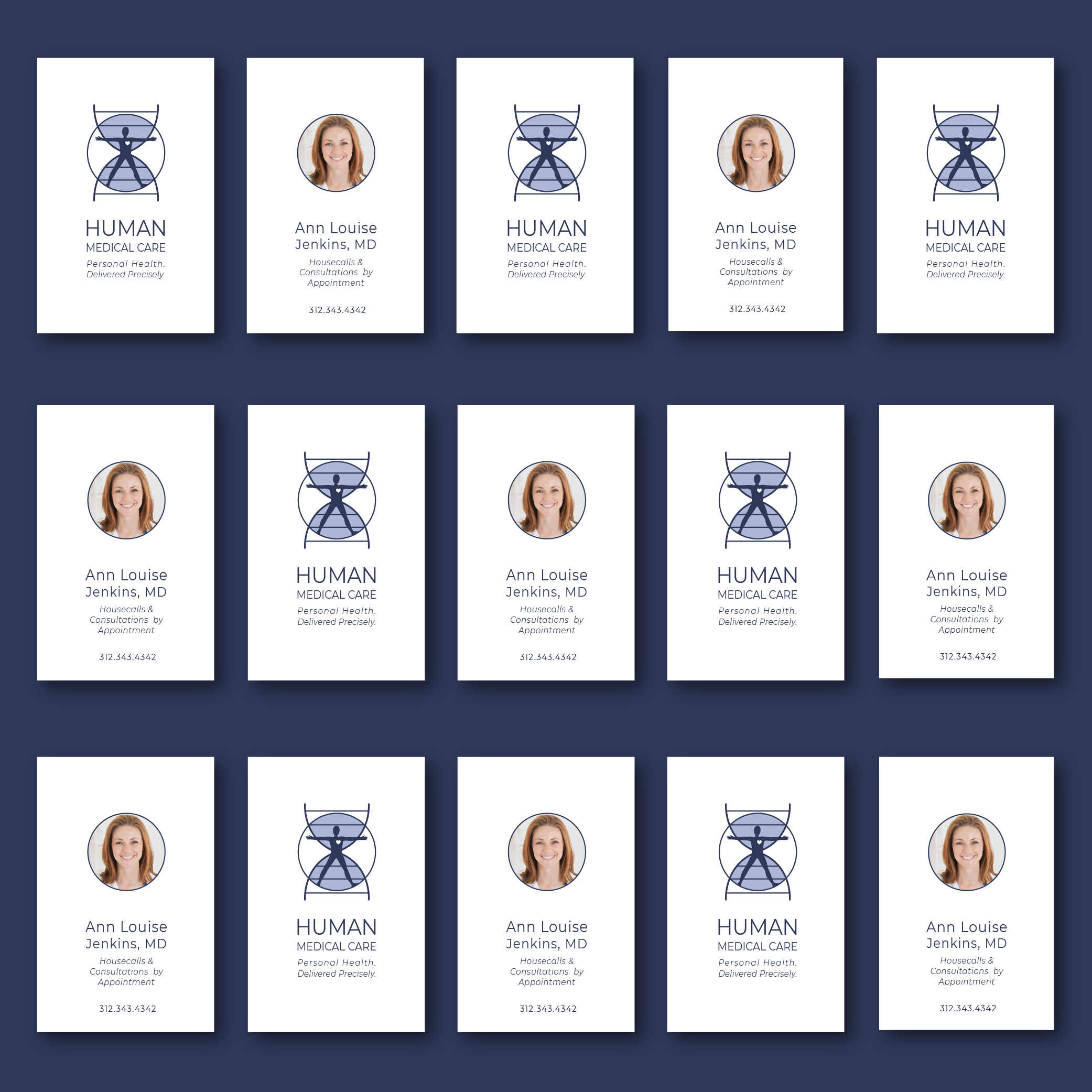
The business cards were designed in a few different styles, the first three in vertical orientation, with a contemporary look and feel, and the las three with the more traditional landscape orientation. The cards are meant to be printed in smooth matte paper, to keep the look clean and professional.
This is the landscape version for the business cards


